The Charts tab in the Insights area provides visual summaries of how individuals or groups are engaging with the system over time.
What You Can Track:
Diary use – which sections are being filled out and how often
Goals – progression, completion, outcomes, and areas of life impacted
Wellbeing – flagged concerns or patterns over time
System use – general engagement and activity levels
Media added – photos, videos, and documents uploaded
Events and alerts – logged incidents, notifications, or important changes
How to Use:
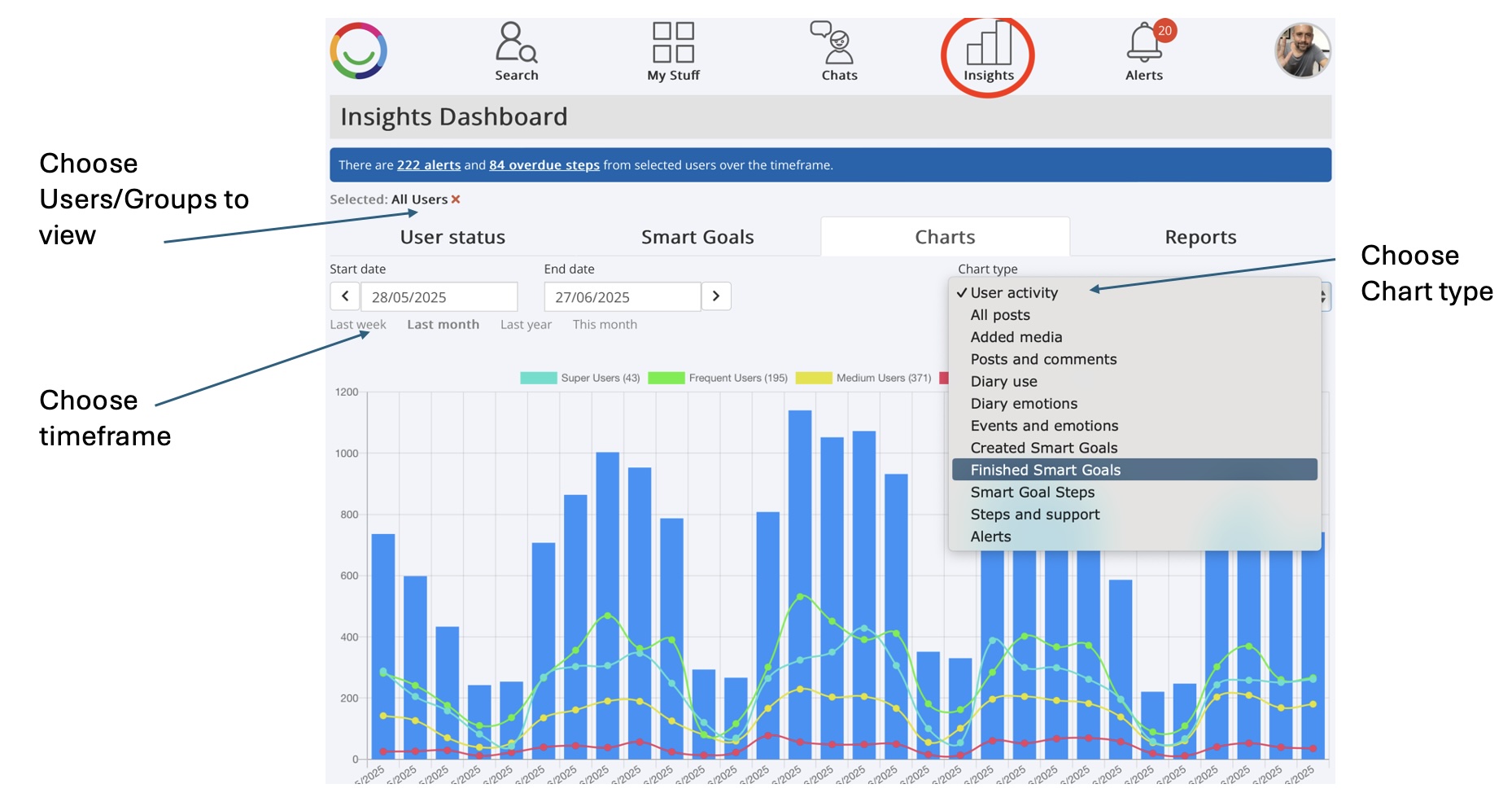
Go to Insights > Charts tab
Select Users or Groups
Choose a Timeframe
Pick a Chart Type from the dropdown
Additional Features:
Interactive charts – click on segments (e.g., pie charts) for detailed breakdowns
Save as Report – export chart data into a CSV file (with user details, goal names, outcomes, etc.) via the Reports tab
Was this article helpful?
That’s Great!
Thank you for your feedback
Sorry! We couldn't be helpful
Thank you for your feedback
Feedback sent
We appreciate your effort and will try to fix the article